Recently, on Twitter and Facebook I noticed graphs of climate change and its impacts being posted. These were often unaccompanied with data sources or links. A lot of misinformation occurs across the web in both denial and support of climate change. Beyond a shadow of doubt, anthropogenically caused climate change is occurring. However, we do the public no favors by posting graphs with uncited sources and complete transparency about sources and data. Below I provide 15 graphs of climate change providing their sources. Overwhelming they portray an alarming picture of changes on our planet. I chose only graphs that depict current or past changes. I specifically excluded projections and focused on patterns where the climate change link is not speculative.
I encourage you to post other graphs below as long as the meet my three criteria (reliable source, unspeculative connection, no projections) and you provide a source link. Anything that does not meet this criteria will be deleted. I will do a followup post with all of your suggestions. Also follow along on Twitter at #climategraphs
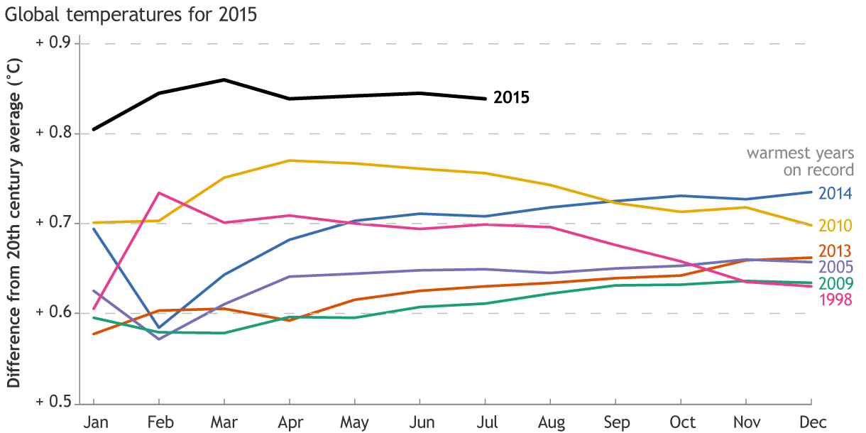
1. 2015 temperatures higher than warmest years on record
Monthly temperatures for 2015 to date compared to the twentieth-century average (black line). This year’s temperatures are running well above the current warmest years on record. Climate.gov graph, based on data from Deke Arndt, NCEI. Graph from here
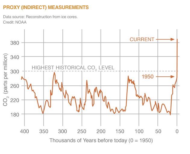
2. Current atmospheric carbon dioxide at highest in last 400,000 years
Figure from http://climate.nasa.gov/vital-signs/carbon-dioxide/
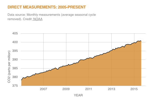
3. Direct measurements of carbon dioxide increases since 2005
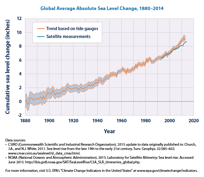
4. Sea level increases since 1880
This graph shows cumulative changes in sea level for the world’s oceans since 1880, based on a combination of long-term tide gauge measurements and recent satellite measurements. This figure shows average absolute sea level change, which refers to the height of the ocean surface, regardless of whether nearby land is rising or falling. Satellite data are based solely on measured sea level, while the long-term tide gauge data include a small correction factor because the size and shape of the oceans are changing slowly over time. (On average, the ocean floor has been gradually sinking since the last Ice Age peak, 20,000 years ago.) The shaded band shows the likely range of values, based on the number of measurements collected and the precision of the methods used. Source
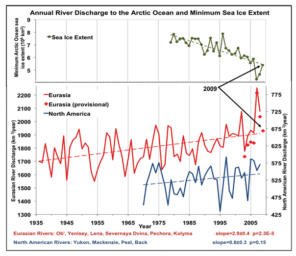
6. Increasing river discharge from melting snow packs into Arctic Ocean
Total annual river discharge to the Arctic Ocean from the six largest rivers in the Eurasian Arctic for the observational period 1936-2008 (updated from Peterson et al., 2002) (red line) and from the four large North American pan-Arctic rivers over 1970-2008 (blue line). The least squares linear trend lines are shown as dashed lines. Provisional estimates of annual discharge for the six major Eurasian Arctic rivers, based on near real time data from http://RIMS.unh.edu, are shown as red diamonds. Upper green line shows the September (minimum) sea ice extent in the Arctic Ocean over 1979-2009 from NSIDC (http://nsidc.org/data). Source
7. Decreasing glacier mass from 1945-2014
This figure shows the cumulative change in mass balance of a set of “reference” glaciers worldwide beginning in 1945. The line on the graph represents the average of all the glaciers that were measured. Negative values indicate a net loss of ice and snow compared with the base year of 1945. For consistency, measurements are in meters of water equivalent, which represent changes in the average thickness of a glacier. The small chart below shows how many glaciers were measured in each year. Some glacier measurements have not yet been finalized for the last few years, hence the smaller number of sites. Data sources: WGMS, 2015 5 Source
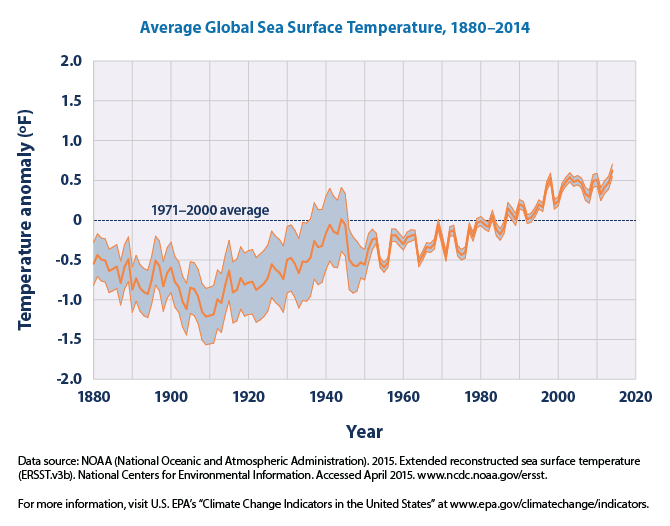
8. Increasing sea surface temperatures since 1910
This graph shows how the average surface temperature of the world’s oceans has changed since 1880. This graph uses the 1971 to 2000 average as a baseline for depicting change. Choosing a different baseline period would not change the shape of the data over time. The shaded band shows the range of uncertainty in the data, based on the number of measurements collected and the precision of the methods used. Data source: NOAA, 2015 Source
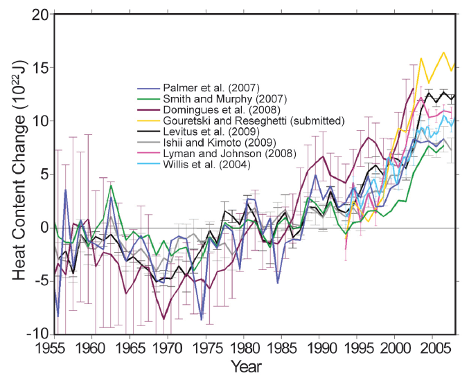
9. Increasing heat content of the oceans since 1955
XBT corrected estimates of annual ocean heat content anomaly (1022 J) for the 0–700 m layer. Differences among the time series arise from: input data; quality control procedure; gridding and infilling methodology (what assumptions are made in areas of missing data); bias correction methodology; and choice of reference climatology. Anomalies are computed relative to the 1955–2002 average. Figure reproduced from Palmer et al. (2010). State of the Climate in 2009, National Oceanic and Atmospheric Administration, National Climatic Data Center, as appearing in the June 2010 issue (Vol. 91) of the Bulletin of the American Meteorological Society (BAMS). [pdf]
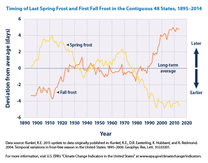
10. Earlier last spring frost and later first fall frost from 1895-2014
This figure shows the length of the growing season in the contiguous 48 states compared with a long-term average. For each year, the line represents the number of days shorter or longer than average. The line was smoothed using an 11-year moving average. Choosing a different long-term average for comparison would not change the shape of the data over time. Source
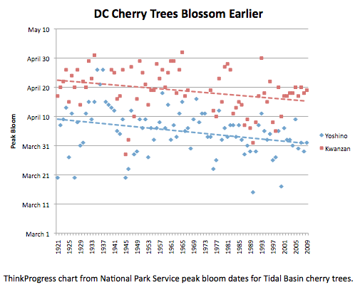
11. Earlier blossoming of cherry trees in Washington, D.C.
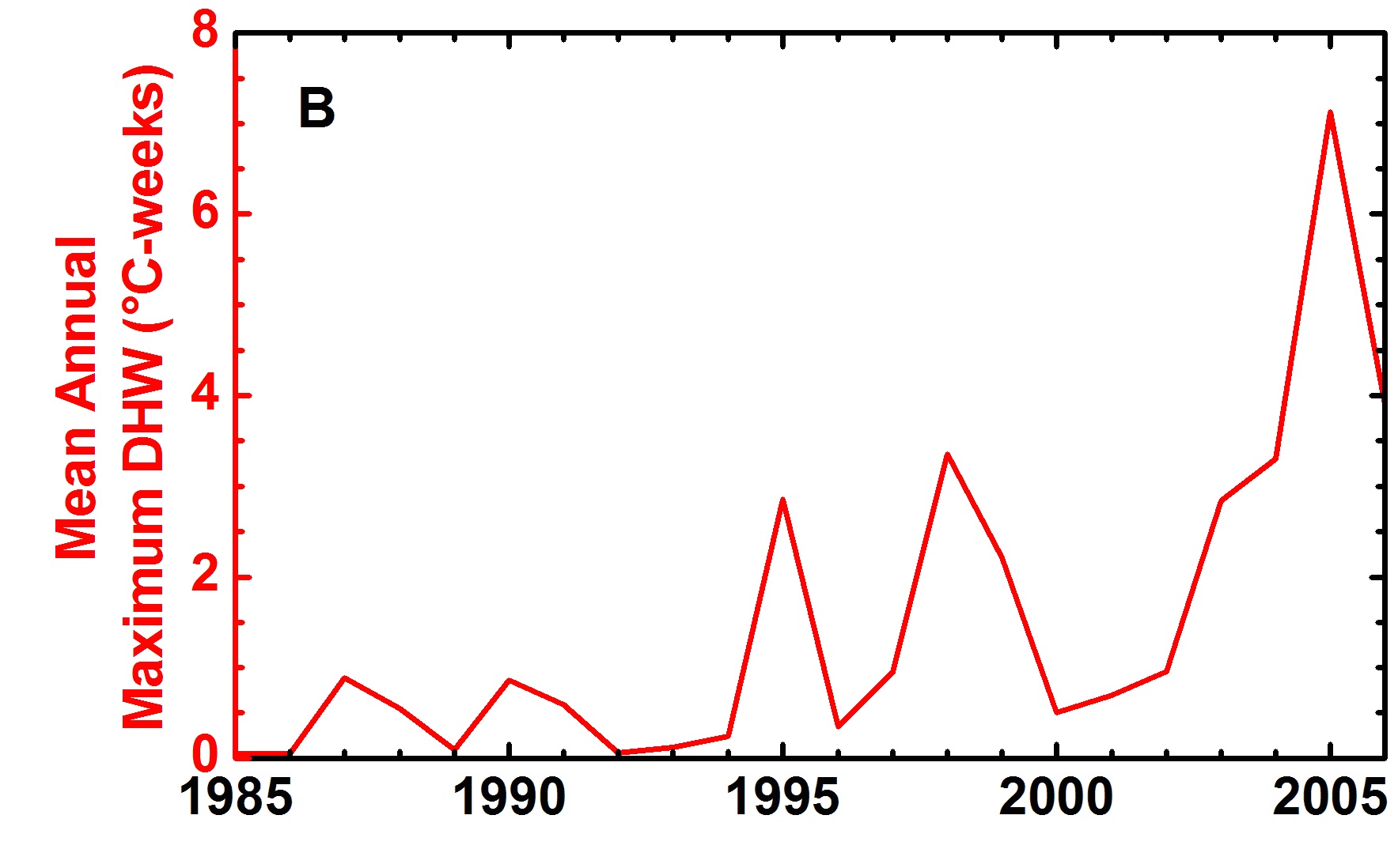
14. Increases of thermal stress on Caribbean coral reefs
Average of annual maximum thermal stress (DHW) values during 1985–2006. Significant coral bleaching was reported during periods with average thermal stress above 0.5°C-weeks, and was especially widespread in 1995. Source
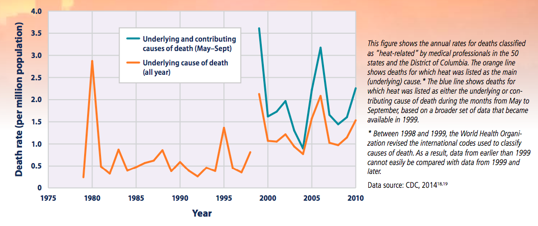
15. Increases in deaths classified as “Heat-Related” in the United States, 1979–2010
One Reply to “A Story of Climate Change Told In 15 Graphs”
Craig Thank you so much this is exactly what I have been looking for. I am 73 but I have studied science at several universities and have taught multi-discipline science for decades at high school and tertiary level. I still consider myself to be a committed teacher. Substantiated evidence is essential otherwise it is just an opinion. i spent much time teaching teachers how to think. Thank you very much again!


Craig Thank you so much this is exactly what I have been looking for. I am 73 but I have studied science at several universities and have taught multi-discipline science for decades at high school and tertiary level. I still consider myself to be a committed teacher. Substantiated evidence is essential otherwise it is just an opinion. i spent much time teaching teachers how to think. Thank you very much again!