
 This is a guest post by Kirstin Holsman, who works on developing quantitative methods for ecosystem-based fisheries management and methods to assess and manage for climate-change impacts on fish and fisheries at the University of Washington Joint Institute for the Study of the Atmosphere and Ocean. This post is based on a great talk she gave this January at the Alaska Marine Science Symposium in Anchorage, Alaska. Also, GO HAWKS!
At its heart, forecasting in science is actually the fine art of quantitative clairvoyance, and scientists, deductive detectives in the business of predicting the future, illuminating the unseen, retracing the footprints of what once was; cartographers mapping the immense universe of the infinitesimally small and vast through the language of math. Those of us in the business of predicting the future do so by tracing the undulating curve of cause and effect back through time. Heuristic explorers, we distill pattern, pencil a thin, tentative line between this and that, and watch to see if the world moves along our trajectory. We regress. We project. We extrapolate. And we get it wrong. Often. So we add more to the quantitative soup, again we draw a line, with a twist here, a split there, and we step back and watch, again. Truth comes to the patient and skeptical scientist, but the rest of the world needs answers. Now. We don’t often have the luxury of years of tinkering. Students have to graduate. Grant money runs out. Maybe after a while, we get a bit better, faster, we start to see patterns in the patterns, we look next to us and see that someone else has found x and suddenly y dawns on us. We backup a step, and run another regression, again. Over and over, picking up where others have left off. And so science goes.
The downfall is the false path; the “mirage” correlation (so well coined by Sugihara et al. 2012) is quicksand in an otherwise solid terrain. Surely there are warning signs, lack of causality must be reflected in disagreement between trends, right? Not necessarily so. In fact, more often than we like, spurious correlations can emerge as statistically significant, highly correlated, and yet utterly unrelated.
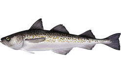
Let me demonstrate, but before I do, I should give you a bit of background. Since I am in the business of fish science, I am going to tell you a bit about some fish, but not just any fish. I am going to tell you about the long, bullet-like walleye pollock that swim ceaselessly in silver shivers through icy dark waters of the Alaskan Bering Sea. Fueled by a perfect storm of ice, wind, and cold nutrient rich waters, the Bering Sea is a gray stretch of horizon that belies the teaming fury of life below the surface. It is there that pollock swim in schools of millions – a large, slowly-spinning cyclone of fish that spreads across a sea the size of Texas (bigger actually). These fish support the largest, healthiest fishery in the world, and have so for decades. That cyclone of fish has swollen and retracted in numbers across the years, reflecting interlaced cycles of temperature, food, and predators. But pollock persist, for now anyway, while the cold waters continue to be cold, and the food continues to flow from the ice-fattened prey of the Arctic. We want to keep it that way; livelihoods and ecosystems rely on these fish. What we want is to slice off a piece of that fish cyclone and fill our bellies (fish stix, anyone?). But we don’t want to be too greedy, we want to take just the amount that can be easily replenished by the billions of new young fish. Young fish that might not make it otherwise, because their hungry older siblings make that a bit hard when they’re all packed in tight up there. So there is some sweet spot, between the number we take and the next generation, the “recruits” to this teeming fury of fish.
Each spawning female fish can produce thousands of recruits, and we scientists assume that if too few of these females produce too little, then a cascade of loss ensues, the little ones not able to keep up with the gauntlet that awaits (predators, disease, starvation, and yes, fishing). But if there are more fish than there is room for, then they will also die. There’s only so much space in that vast Texas-sized sea, if you can believe it. There is a limit to all life, in the form of food, space, and the number of predators drawn to the overflowing banquet table. Somewhere in between is that sweet spot. And if we know where that is, we can take just the right amount without driving the population into a downward spiral. It is a bit of art to do this. But it hinges on knowing the number of female spawning fish and predicting the fate of their offspring. But as I said, this is a bit of art, in fact, a whole branch of science has grown up around this, the most central key to getting fishery science right. Let me show you now why it is tricky, and maybe shed some light on how to avoid the pitfall of connecting too many dots.
You see, I am a master of fish science. I am so good at this I can actually predict not just the future of fish, but your future, dear dedicated Seattleite. And I have great news for you. This Sunday the Seahawks will win the Super Bowl! How do I know? Well, the fish told me so. And fish, they don’t lie. You don’t believe me? Well just take a look. Below is a plot of spawning biomass of pollock over the years in the green, and there tracking right along with it, is the Seahawks point differential in the following year (in blue). Together up and down those two lines go for 30 years, splitting for a while but coming back together again. Year after year, the more fish in that great Bering Sea, the more Seahawks touchdowns are scored and the more stifling the defense becomes. This pattern is so strong that we scientists anoint it as “statistically significant” and pronounce that the relationship has an R2 of 0.8 (science-speak for the strength of the relationship; an R2 of 1 is a perfect relation).
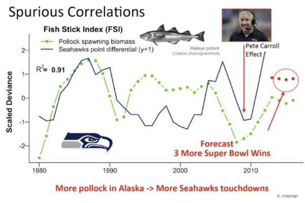
But wait, there’s more, if I add a little more information, in the form of the effect of Pete Carroll joining the franchise, holy cow, this relationship now has an R2 of 0.9. A 90% correlation, that’s too good for chance, right? Further, if I follow that pattern forward (because we have 4 more years of predicted fish biomass), we arrive at some very great news (for Seahawks fans, anyway). Because last year was a Super Bowl win (go hawks!), and this year’s spawning biomass is still going just as strong, we can safely deduce that the Seahawks will repeat that win on Sunday. In fact, the pollock assessment predicts strong biomass over the next two years as well, so I think, we’re in store for a three-peat and a four-peat(?) as well. Fish don’t lie
Ok, cue that little voice in your head from first-year statistics that echoes infinitum: “correlation is not causation”. This appears to be an example of the dreaded spurious, “mirage” correlation (though a good one). So what went wrong here? Well, I abandoned one of the basic requirements of identifying causation: a mechanism (fish oil supplements fueling Seahawks wins? No, no, that’s just silly).
The question is, if a lack of mechanistic underpinning is the root of such spurious relationships, can we go forward, albeit cautiously, to find relationships that are real if we have a strong hypothesis and clearly defined heuristic relationships? Can we test this using a series of proxies, each a granite step closer to the true sources of life and death for that great throng of fish in the Bering Sea? Does our ability to predict the future improve as we ascend this ladder of trophic proxies? And if so can we then look into our mathematical crystal ball and see a real future, rather than the mirage upon the horizon?
In short, I think the answer is yes. But this is the art of science, and mathematical models the quantitative laboratories of the fortuneteller. So here are a few suggestions based on the lessons I’ve learned the hard way from experience (both field and modeling). First (always first) establish the mechanism by which two dots might be related. With that, start to trace the thin thread of pattern back through time, up through food-webs, or out into the un-illuminated future. Don’t rely on correlations and t-tests. Don’t simply believe “significance” like some dull-eyed, stats zombie. Write clear, mechanistic relationships on a piece of paper before you turn on your computer. Know your error, both in your data and in your predictor variables. Add up all the fog of uncertainty correctly. Ask someone to help. Simulate. Validate with out-of-sample tests. Compare alternative models, not just null models, but alternative possibilities and formulations. Better yet, compare alterative systems. Test your hypothesis in the lab if you can. There is nothing more humbling, and better able to snap you back to the real world than a laboratory experiment. Run those experiments in the basement of your parent’s house if you have to (yes, it can work). Observe with a different method (yes, I am telling you that you do in fact need that goPro for science]. Finally, build a model, put all of that information into a tinker toy-like model made of math. Now, invent a false, wrong reality where you take away the sun or kill off all the fish. And see if you can still recreate the pattern. How much does everything change? Don’t be afraid to predict, but be ready to correct course. And always, always, always include error bars and confidence intervals. And for goodness sakes, get others to help. Grad students are perfect for this; regularly feed them fancy cheese and beer and you will be their hero.
Follow this advice. But know, when the elation of Super Bowl pandemonium spills out onto Pike Street this Sunday, I’ll be submitting my work on the “fishstix index” straight to Science.
Reference:
Sugihara G et al. (2012) Detecting Causality in Complex Ecosystems Science 338, 496 DOI: 10.1126/science.1227079
Share the post "Spurious correlations: How Alaskan pollock predict a Seahawks Super Bowl win!"
Related Posts
 Hipster bacteria hate the tropics (it’s too mainstream)
 Media hype gets you more citations? Well, it did for this fisheries paper.
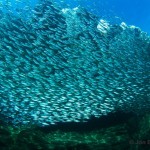 How to eat sardines sustainably
 A San Diego 5th grader is trying to end shark finning, will you help?
 A wicked bad idear: National Geographic hunts bluefin tuna for entertainment